At the end of last month Microsoft released their Consumer Preview for Windows 8 and, as usual, I
couldn’t resist the temptation, so I promptly downloaded the ISO to have aplay ![]() . Now I think
it’s about time I shared my experience with you.
. Now I think
it’s about time I shared my experience with you.
Installation
As you would expect with a new release of Windows, the installation process is once again very simple.
- Insert the CD into the drive and boot the computer
- Select your language, time & currency, and your keyboard layout
- Click Install Now
- Enter your product code and agree to the Terms & Conditions
- Select install type (Upgrade or Custom/Clean install)
- Choose where to install
Once Windows has completed the installation steps, you are then guided through the initial Out of Box Experience (OOBE), otherwise known as the initial setup and personalisation of the system. This is where you are first introduced to the new Metro UI. Each option screen takes up the whole screen with no borders or menu bars etc. Finally, instead of asking you to setup a user account on the computer, you are now presented with a screen asking you to sign into you Microsoft account (previously known as a Windows Live ID). This isn’t compulsory, there is an option to sign in without a Microsoft account at the bottom of the screen.
That’s it. Now the computer loads up into the new operating system ready to go.
First Impressions
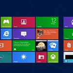
Once Windows 8 is installed, you are presented with the brand new Metro Start Button interface. This looks very much like the current Windows Phone interface, but scrolls horizontally not vertically. This is the replacement for what we currently know as the start button. This shows that Microsoft are now seriously looking at the tablet market. The new interface is very much a new take on many of the popular tablet interfaces currently on the market. I’m not too sure how successful this will be in a desktop environment, but that is what I intend to find out, mainly due to me being devoid of any form of tablet PC at my disposal.
The first thing that strikes you is that the desktop is not loaded by default, although there is an item in the new Start Menu for the desktop. The default view is the horizontal Start Menu. The ‘tiles’ are neatly arranged in groups and you can move and resize these to suit yourself by simply right clicking the tile you want to change and selecting the relevant option from the popup menu at the bottom of the screen.
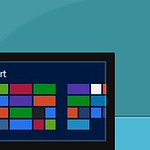
To make the new UI function on a desktop, as well as a Tablet PC, Windows 8 makes use of ‘Hot Corners’ for accessing the various menus normally accessed by a swipe from the side. Holding the mouse into the lower left corner of the screen brings up the new ‘Start Tip’ (what most people will think of as the new start button) so you can get back to the Start Menu screen from within other applications, or from the desktop. The upper left corner of the screen brings up the switcher showing the previous app in use, but moving the mouse down along the side of the screen brings up other apps. Both right hand corners bring out the new ‘Charms’ menu which gives you access to a number of system tools that are accessible where ever you are in the new Windows 8 ecosystem. Most of these mouse over actions are easy to used to and work very well, but I think I will prefer using WIN+TAB to get the switcher up. That particular bit is a real pain to get right and it seems to disappear before I get the chance to click what I want. I’m sure this is much easier with a tablet, and that it is simply something I will need to get used to when I eventually upgrade properly.
In general I think Windows 8 is going to be another leap forward for Windows, and it all seems very highly polished, but I’m not too sure how your average desktop/laptop user will fair with it as it is clearly designed to be best used on a Tablet PC. I am going to keep using Windows 8 for a little while now to see how it fairs on a laptop, and maybe I’ll do another post about how I fair with it in a few weeks.


